Basic design - editing attributes
In the Property Bar - > Properties tab, you can edit the properties of pages, windows, views, and controls.
Properties include Generic Properties that need to be set for each object and Specialized Properties that are specific to certain controls. This section describes the generic properties, and the specialized properties are described for each control in the Control Description section of the Advanced Design.
General properties include: Name, ID, Coordinates, Absolute Coordinates, Width, Height, Block Touch, Transform, Texture Compression Mode, Replaceable Upgrades, Texture Settings, Variables, Actions.
Name has a default value, user can click the text box to change it, after inputting the new name, you need to press enter key to confirm.
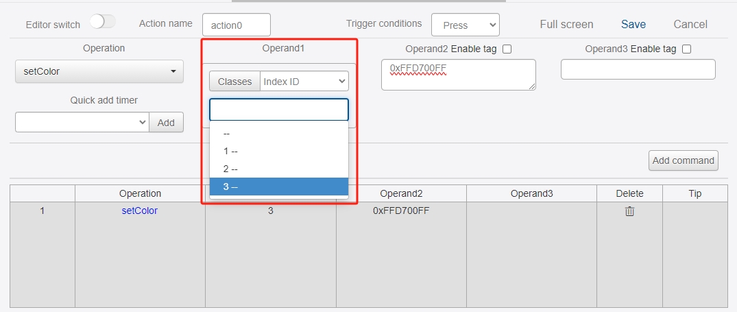
ID can be set to 0, 1, 2, 3... Note that you can not repeat the ID setting, ID is mainly in the action setColor, clearData, setMove, setMoveX, setMoveY, changeMove, changeMoveX, changeMoveY, setScale, setScaleX, setScaleY, changeScale, changeScaleX, changeScaleY, setRotate, changeRotate, setRotateCenter, setRotateCenterX, setRotateCenterY, The changeRotateCenter, changeRotateCenterX, changeRotateCenterY directives act as markers when used.
The "coordinateX" and "coordinateY" are the position information of the object relative to the previous level. If the current object is a control, the coordinate X indicates the horizontal distance between the upper-left corner of the control and the upper-left corner of the view, and the coordinate Y indicates the vertical distance between the upper-left corner of the control and the upper-left corner of the view; if the current object is a window, the coordinate Y indicates the vertical distance between the upper-left corner of the control and the upper-left corner of the view. If the current object is a window, the X coordinate indicates the horizontal distance between the upper left corner of the window and the upper left corner of the page, and the Y coordinate indicates the vertical distance between the upper left corner of the window and the upper left corner of the page. You need to press the Enter key to confirm the modification. Select the control in the edit area and drag the mouse to change the position of the control.
The "Absolute X" and "Absolute Y" are the position of the control relative to the whole interface, and can be modified in the same way as "X" and "Y". Y" are the same as "X" and "Y".
"Width" and "Height" are the dimensions of the control. You need to press the Enter key to confirm after entering the values. When the control is selected in the edit area, small squares will appear positioned at the 4 vertices and the midpoints of the 4 edges of the control, and the size of the control can be changed by dragging the small squares.
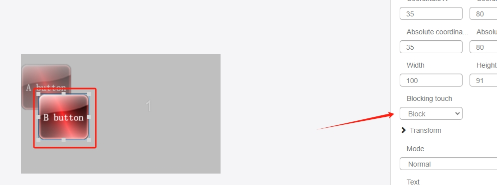
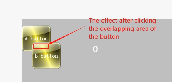
The "Block Touch" function allows you to set touch "penetration" or "blocking" for controls with touch functionality, for example, if you add a button A and a button B to a view, the two buttons have overlapping parts and button A is in the middle of button A. For example, add a button A and button B in the view, the two buttons have overlapping parts and button A is at the bottom, button B is at the top, first set the "Block Touch" of button B to "Do not penetrate";
After opening the emulator and clicking on the overlapped area of the two buttons, you will find that the lower button A is not clicked.
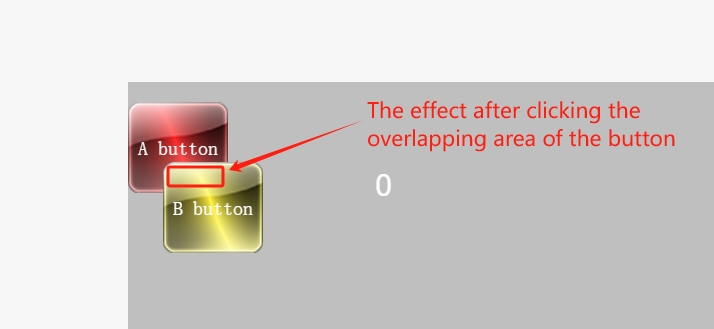
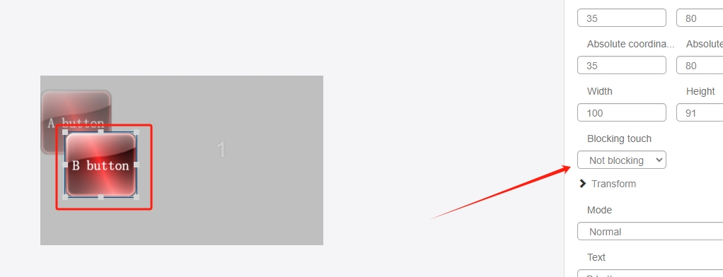
At this time, if you set button B's "Block Touch" to "Penetrate", you will see that button A is not being clicked.
After opening the emulator and clicking on the overlapping area of the two buttons, you will find that both buttons are clicked.
The "Transform" function module allows you to zoom in and out of a window or control horizontally or vertically, rotate it around a point, and project it horizontally or vertically (similar to 2.5D perspective).
Let's take the transformation of a layer control as an example, the following picture shows the effect before transformation
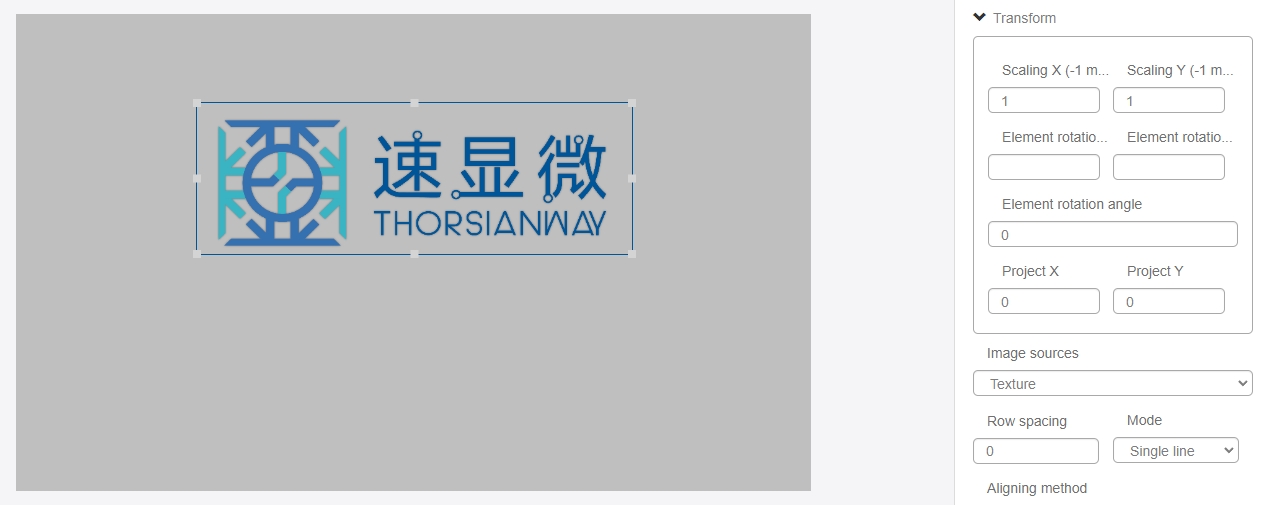
Adjust the "Scale X" parameter - "Scale X" is to adjust the length of the control's X-axis direction, the default value is 1, and the adjustment range is between 0.0078125 and 8 or -1, the following is changed to 1.0078125 to 8 or -1. The default value is 1, the adjustment range is between 0.0078125 and 8 or -1, the following is the effect after changing to 1.5:
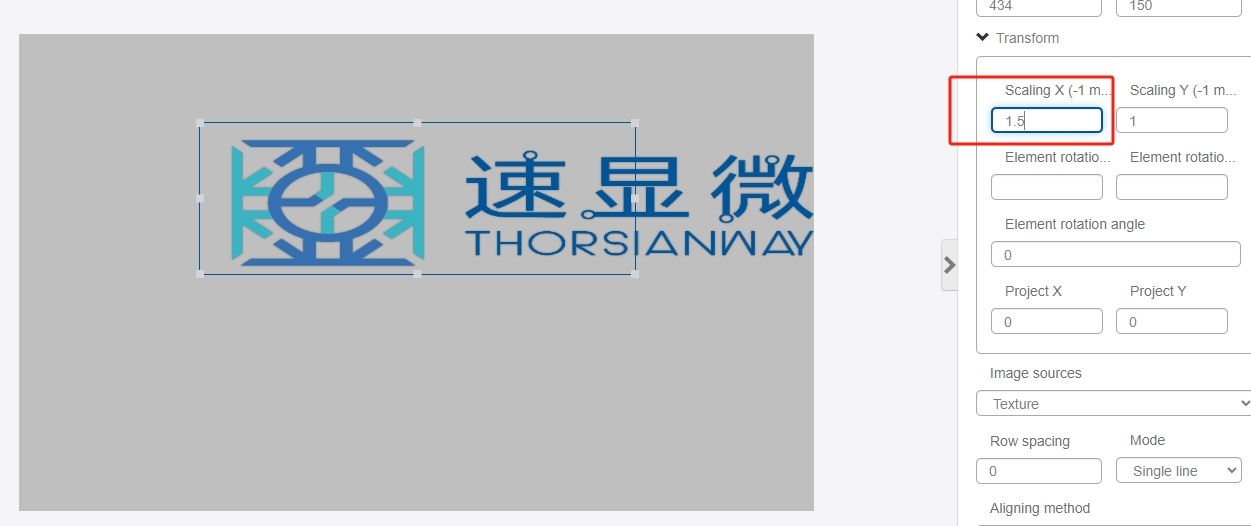
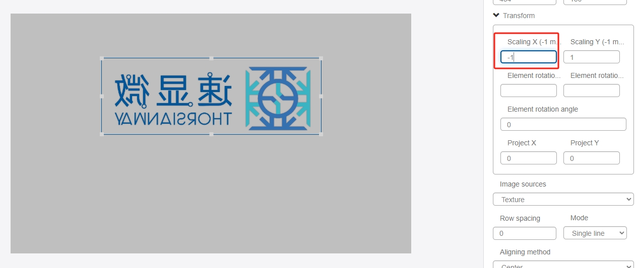
You can see that the width of the display of the control is stretched to 1.5 times, if you set the "Scale X" to a value between 0.0078125 and 1, the width of the display of the control will be narrowed, if you set the "Scale X" to -1, you will get the original image of the mirror. If you set "Scale X" to -1, you will get a mirror image of the original image, with the following effect:
The "Scale Y" parameter has the same effect. Scaling X and Scaling Y can not only scale the control of displaying pictures, but also scale the control of displaying text**. When the font size of the control of displaying text is set to the limit of 64 and still not big enough, you can use the "Transform" function of the "Transform" function. When the size of the text control is set to the limit value of 64, you can use the "Zoom X" + "Zoom Y" in the Transform function to zoom in the text control.
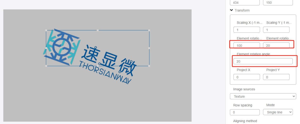
Adjust "Element Rotation Center X" + "Element Rotation Center Y" + "Element Rotation Angle" - "Element Rotation Center X" + "Element Rotation Angle" - "Element Rotation Center Y" + "Element Rotation Angle". The "Element Rotation Center X" and "Element Rotation Center Y" set the center of rotation based on the upper-left corner (0,0) of the control, and the "Element Rotation Angle" sets the rotation angle of the control. The "Element Rotation Angle" sets the rotation angle of the control. If we set the element rotation center X to 100, the element rotation center Y to 20 and the element rotation angle to 20, we can get the following effect:
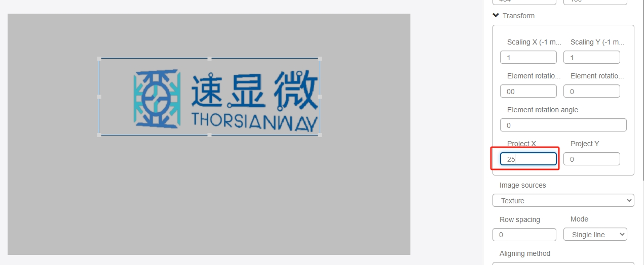
Adjust the "Projection X" - you can make a 2.5D-like transformation effect on the control, if the parameter is positive or negative, there will be a transformation effect in the opposite direction, set the "Projection X" to 25. The effect is as follows:
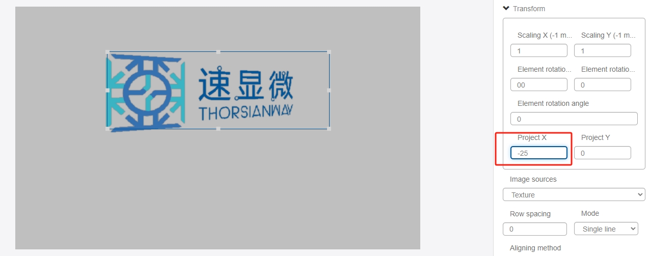
Set the "Projection X" to -25, the effect is as follows:
The effect of adjusting "Projection Y" parameter is the same. "Projection X" and "Projection Y" can produce a similar 2.5D transformation effect on the control, it should be noted that the magnitude of the adjustment of the two parameters can not be too large, it is recommended to control the magnitude of the parameter adjustment is too large to make the edge of the graphic The parameter is too large to make the edges of the graphic jagged, which affects the viewing experience.
The effect of transforming the window is similar, all the controls in the window will be transformed.
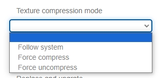
"Texture Compression Mode" The drop-down list allows you to select whether or not to compress the texture image, the user can choose to follow the system, force compression or force no compression. No selection defaults to follow system. Compression can reduce the size of the project package, but the quality of the image is damaged. Users can choose the compression mode according to their needs.
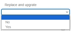
"Replaceable Upgrade" The replaceable upgrade function is used to reduce the acf file burning time, after selecting "Yes", when burning acf file, it will automatically compare the difference between the current acf file and the last acf file, and only select the data to be burned into the different areas to shorten the burning time.
"Texture Settings" is the display appearance of the control, with one or more texture setting items depending on the type of control (trigger controls are logic controls and do not have texture settings). Click the Edit button of the corresponding texture item to bring up the "Select Image" dialog box.

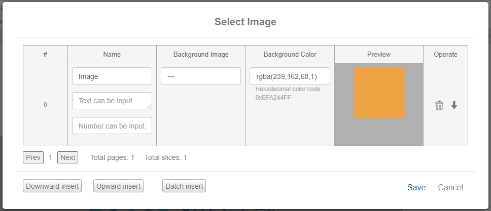
The texture names of most controls are not modifiable, users can set a background image or set a solid background color.
If you are using an image texture, click on the "Background Image" option and select the previously uploaded image resource from the drop-down list.
If you use a solid color texture, there are two ways to set it. One is to modify the rgba array value directly in "Background Color" option. The first three numbers in the array represent the primary colors of red, green and blue, the value range is 0-255; the last number represents the transparency, the value range is 0-1, 0 represents completely transparent, 1 represents completely opaque. One is in the "background color" drop-down color picker to select the color and transparency, click "OK" to complete the modification.
You can see the control texture in the preview box. If you set both background image and background color, the image will be overlayed on top of the background color.
If the texture is set to the background image, you can click the "Match this texture" button and the control width and height will be adapted to the size of the background image.
The "Variables" and "Actions" properties allow the control to perform logical functions, interact with external information, and perform predefined actions based on input data. This section is described in Variables and Actions in Advanced Design.