Button Switch
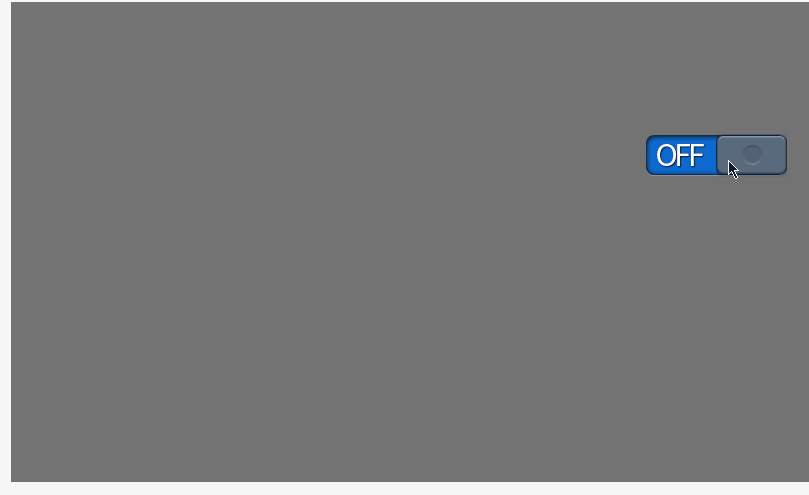
Button Switch are switches that have a toggle effect. The "on" and "off" state is realized by the left and right position of the switch slider on the background of the switch. If the value of the bound variable is 0, it will show the "on" state, while other values will show the "off" state.
Click the "Add Control" button in the "Edit" menu, and select "Pushbutton Switch" in the drop-down list of controls.
The message "Add Widget Successfully" will pop up in the upper right corner of the interface, and you can see the newly added control in the "Edit Area". Select the control, you can edit it in the "Properties" column.
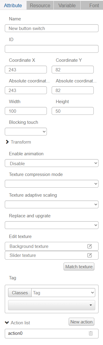
Name, ID, Coordinates, Width, Height, Blocking Touch, Transform, Texture Compression Mode, Replaceable Upgrade, Texture are common attributes, which are introduced in the "Basic Design - Edit Attributes" section, so we won't repeat them here.
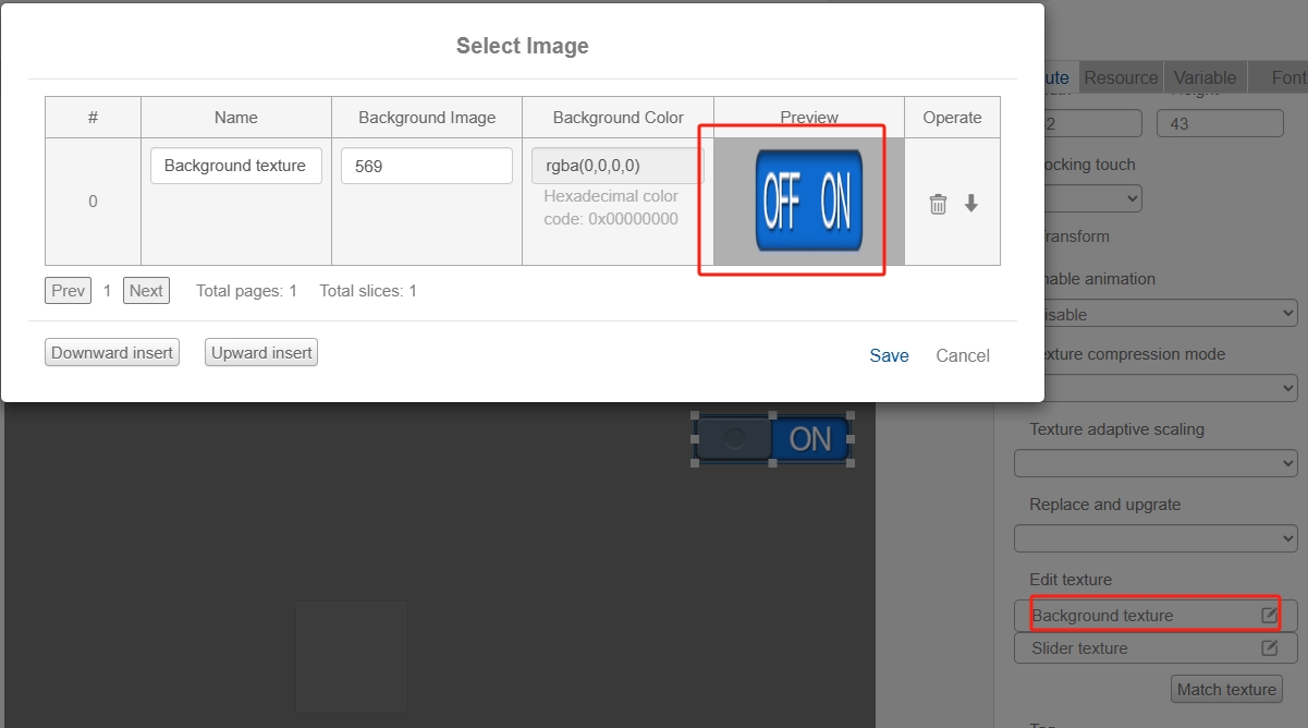

Note that the height of the "Switch Slider Texture" image should be the same as the height of the "Switch Background Texture" image, and the width of the "Switch Slider Texture" image should be half of the width of the "Switch Background Texture" image. The width of the "Switch Background Texture" image should be half of the width of the "Switch Background Texture" image;
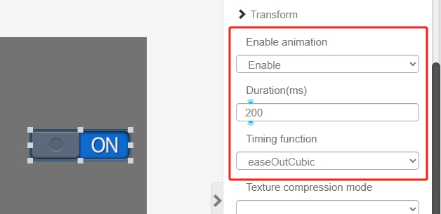
In addition, the button switch control must be bound to a variable to take effect, the user can choose to turn on the animation, set the duration, and have a dynamic effect when the position of the switch slider changes.
For example, if you turn on the animation of the button switch control, when you click the button or change the value of the variable in the runtime debugging interface, it will have the following display effect of the switch state: