Gallery
Gallery control implements the function of dynamically displaying multiple images. The user uses registers to control Gallery control via variables to dynamically center the corresponding image in multiple images.
Click the "Add Control" button in the "Edit" menu, and then click "Photo Bar" in the drop-down list of controls.
The message "Add Widget Successfully" will pop up in the upper right corner of the interface, and you can see the newly added control in the "Edit Area". Select the control, you can edit it in the "Properties" column.
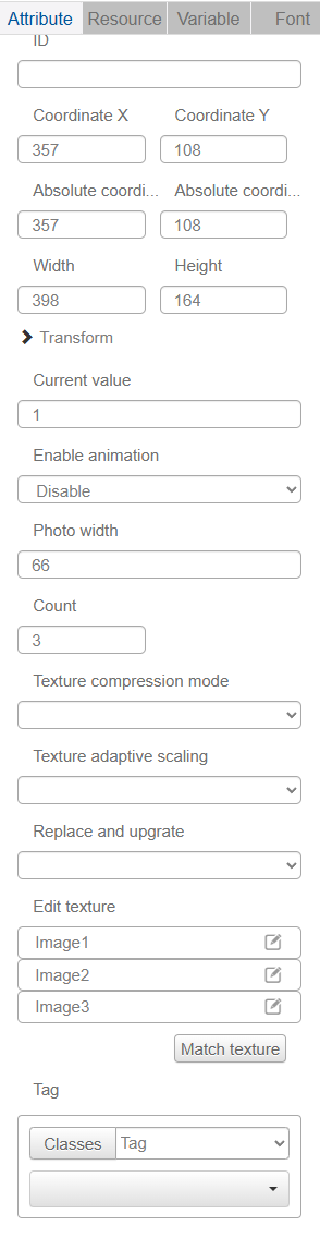
Name, ID, Coordinate, Width, Height, Block Touch, Transform, Texture Compression Mode, Replaceable Upgrade, Texture are common properties, which are introduced in the "Basic Design--Edit Properties" section, so we won't repeat them here.
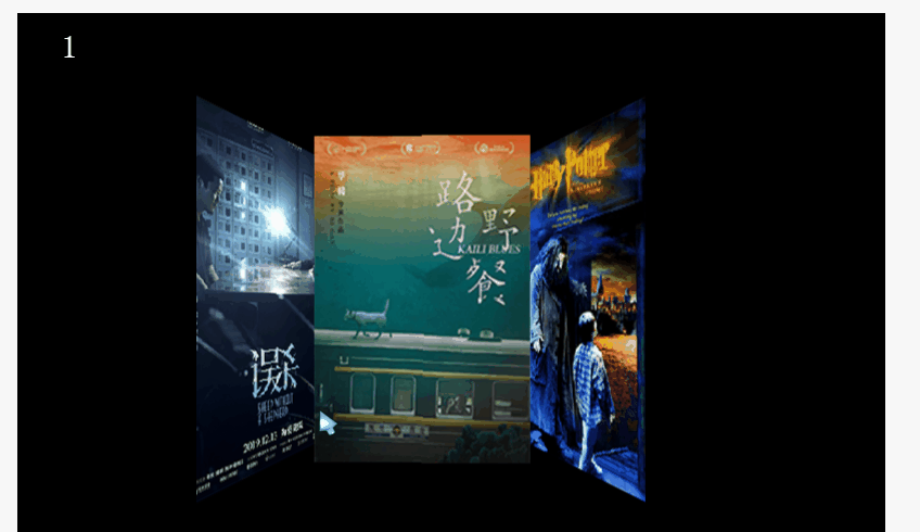
You can assign 0, 1, 2 to the "current value"... You can find out the corresponding pictures of Gallery by assigning values 0, 1, 2 to the "current value".
Users can choose to turn on or off the animation according to their needs. After turning on the animation, you need to set the "Duration" and "Time Curve", so that there will be animation effect when switching pictures in Gallery control.
Users can set "Picture Width" to change the display width of the picture in the center of Gallery, and then manually adjust the height of Gallery control to keep the picture in its original proportion.
If you want to insert five pictures into Gallery, just enter 5 in the "Number" field.
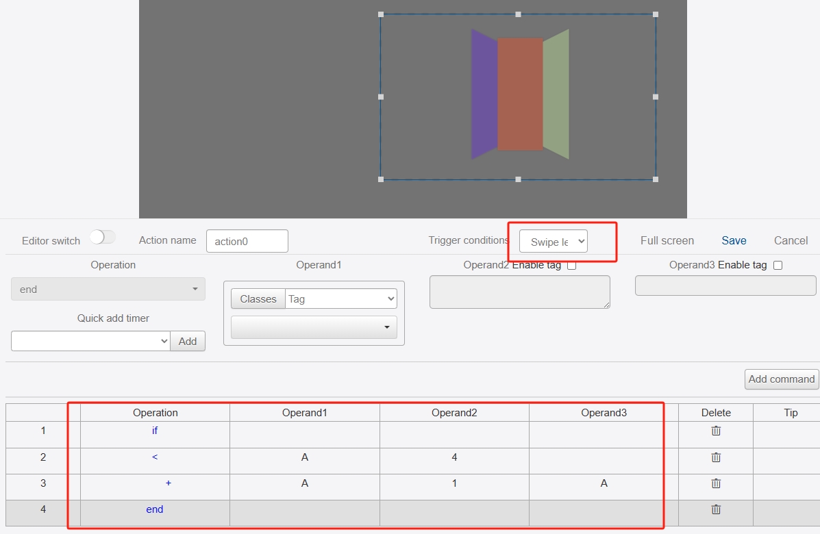
Usually you can use the SlideResponse control to control the image switching of the PhotoBar control by giving the SlideResponse control's SlideLeft and SlideDown controls the ability to switch between the two. By giving the SlideResponse control the Slide Left and Slide Right editing commands, you can realize the animation effect of Gallery control's sliding image switching.
The following is the Slide Left command of the SlideResponse control.
Here is the IDE simulation: