Button
Click "Add Control" button in "Edit" menu, and then click "Button" in the drop-down list of controls. In the upper right corner of the interface, the message "Add Widget Successfully" will pop up. In the "Edit Area", you can see the newly added button control, and you can edit it in the "Properties" column.

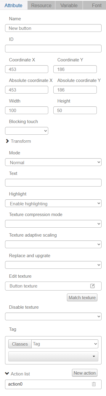
Name, ID, Coordinates, Width, Height, Block Touch, Transform, Texture Compression Mode, Replaceable Upgrade, and Texture are common attributes, which are introduced in the "Basic Design - Edit Attributes" section, so we won't repeat them here.
The Mode drop-down option has two modes: Normal and On/Off. The button in normal mode will automatically pop up after being pressed; the button in switch mode will remain pressed or pop up, and the value of the variable will be 0 before being pressed and 1 after being pressed after being bound to a variable in the simulation; if no variable is bound to a variable, it will be shown as pressed state by default.
"Text" is the text displayed on the button control, default is "button", you need to press enter key to confirm after editing, if you don't need the text on the button, you can delete it directly.
User can choose whether to enable highlighting or not.
The texture of the button has three editable options: before pressing, after pressing and highlighting.
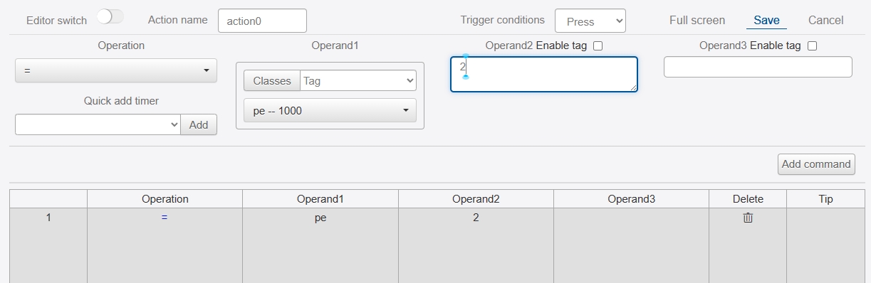
You can add various commands to the action of the button and combine them according to the user's needs, see the introduction of "Actions" in "Advanced Design - Variables and Actions". This is also the most frequently used function of the button control.