Keyboard Container
Keyboard Container is a keyboard group control that enables touchscreen input. It allows for more content input than an in-page keyboard.

Basic usage reference Keyboard, In-Page Keyboard. After adding the Keyboard Container control, only the keyboard background is displayed in the edit area, no keys. You can select numeric, English or Chinese keyboard from the keyboard type drop-down menu. Click "Generate Default Keyboard" to generate the corresponding default keyboard style according to the selected keyboard type.
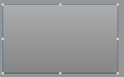
First add a Keyboard Container control

When "Numeric" is selected as the keyboard type, click "Generate Default Keys":
This keyboard can be used to enter numbers

When "English" is selected as the keyboard type, click "Generate Default Keys":
This keyboard can be used to enter English letters

When "Chinese" is selected as the keyboard type, click "Generate Default Keys":
This keyboard can be used to enter Chinese characters

Keyboard Container property settings
Container ID is an automatic system number and cannot be modified by the user.
The Password Mode drop-down menu allows the user to select the password to be visible, or the password to display an asterisk.
Minimum and maximum values can only be set when the Keyboard Container is of numeric type, it is the range of tag value bound to this Keyboard Container, the input value beyond the range can not be assigned to the tag, and the tag value will not be changed.
Input Limit is the bit limit of the input value of the keypad container.
Keyboard Containers must be bound to variables to be used. Keyboards of numeric type must be bound to variables of numeric type, and keyboards of English type must be bound to variables of string type.
Please note that it is not recommended that users perform copy and paste operations on Keyboard Container controls. Unless the properties of both keyboards are exactly the same, an error may occur!!!!
Keyboard Key Properties Setting
After the user clicks "Generate Default Keyboard", the system generates a set of keyboard keys and a text input box. You can see the list of keys in the navigation pane.

You can refer to Text Input Control to edit the text input box.

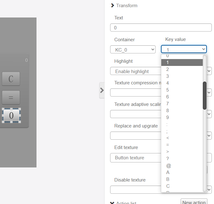
Text is the text displayed by the key.
Container shows the subordination of the key to the Keyboard Container.
The Key Value drop-down menu is optional and indicates the value passed when the key is pressed.
Texture settings and action settings for keys are not described here.
Adding your own keys
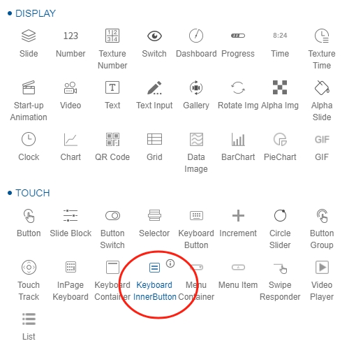
If you are missing keys, you can add them manually by adding the "Keyboard Keys" control.

Select the corresponding container.

Select the key value to be set

Modify the text and adjust the width and height of the control.

This successfully adds a button.