Circle Slider
The Circle Slider control is another form of slider control, where a touch causes the slider to slide along a ring track to change the value of a variable bound to it.
Name, ID, Coordinate, Width, Height, Block Touch, Transform, Texture Compression Mode, Replaceable Upgrade, Texture are common properties, which are introduced in the "Basic Design - Edit Properties" section, Maximum, Minimum, Low Alarm, High Alarm, Start Angle, Initial Value property and Gauge property. Maximum, Minimum, Low Alert, High Alert, Start Angle, Initial Value properties are similar to the properties described in the Dashboard control and will not be repeated here.
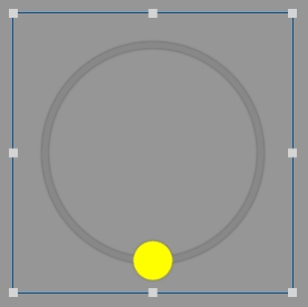
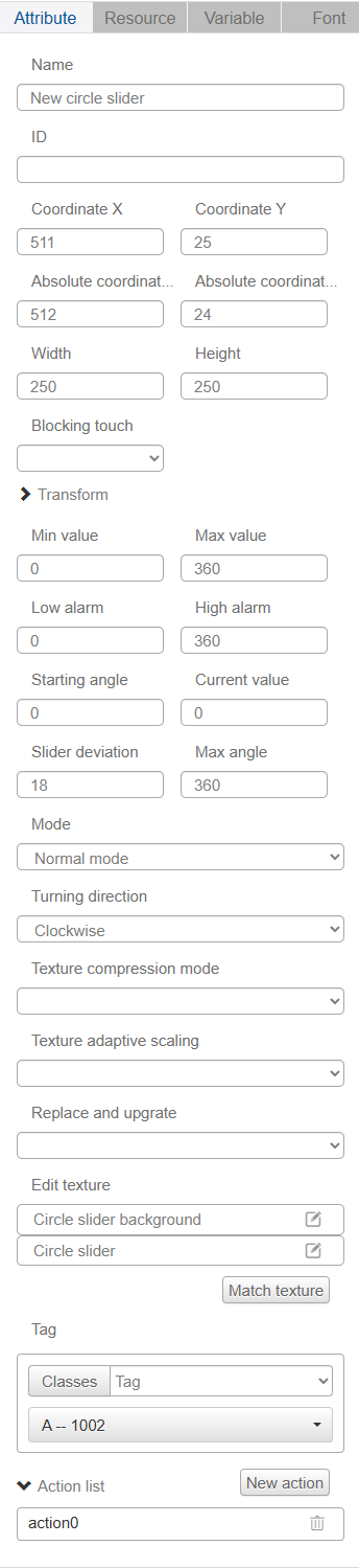
Adjust the "Slider Offset" parameter to move the slider away from or closer to the center of the circle (a positive parameter is closer to the center of the circle, a negative parameter is farther away from the center of the circle), in the absence of zoom adjustments to the width and height of the control this parameter can be adjusted within the following range: -Slider image width/2 to control width/2-slider image width;
The touchable radius of the slider ranges from: control width/2 + slider deviation - slider image width x2 to control width/2 + slider deviation + slider image width x2
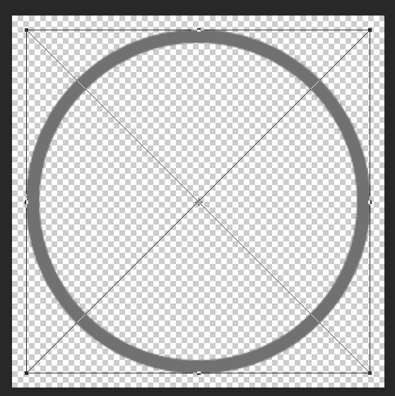
Note that the slider image is sliced as follows, so that the slider image is square and the graphic in the slider maintains symmetry along the diagonal + horizontal symmetry + vertical symmetry.
If you want to make the slider's touchable range wider you can increase the width and height of the slider's background image, so that the background image is surrounded by more transparent areas, as shown below in the PS operation.
Users can choose "Normal Mode" and "Complex Mode" according to their needs, "Complex Mode" can be inserted into the progress bar background image.
The "rotation direction" can be clockwise or counterclockwise.