Text
Click "Add Control" button in "Edit" menu, and click "Text" in the drop-down list of controls. The message "Add Widget Successfully" will pop up in the upper right corner of the interface, you can see the newly added text control in the "Edit Area", and you can edit it in the "Properties" column.


Name, ID, Coordinates, Width, Height, Block Touch, Transform, Texture Compression Mode, Replaceable Upgrade, and Texture are common attributes, which are introduced in the "Basic Design - Edit Attributes" section, so we won't repeat them here.
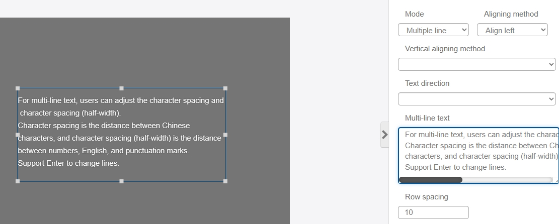
The mode drop-down option allows you to select single line or multiple lines. By default, users can directly enter the content to be displayed in the "Text". If you choose multi-line, you need to enter the content in the "Multi-line text" input box, Enter to change the line, Ctrl+Enter to complete the input.
For multi-line text, users can adjust the character spacing and character spacing (half-width). Character spacing is the distance between Chinese characters, and character spacing (half-width) is the distance between numbers, English, and punctuation marks. Support Enter to change lines.
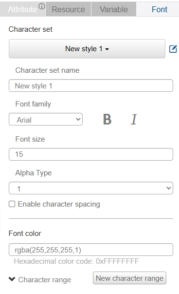
In the "Font" column, you can modify the font size, color, transparency and other information.
Scroll display--In IDE version 1.10.18, the text control supports scroll display, select "Scroll" in "Scroll Display" to enable it, and you can set the following settings Scroll direction" (left or right), "Duration", "Auto-rebound", "Time curve", "Delay time", "Scroll direction", "Scroll direction", "Scroll direction", "Scroll direction", "Scroll direction", "Scroll duration", "Auto rebound", "Time curve", "Delay time". and "Delay time" (only valid for the first scroll), for example:
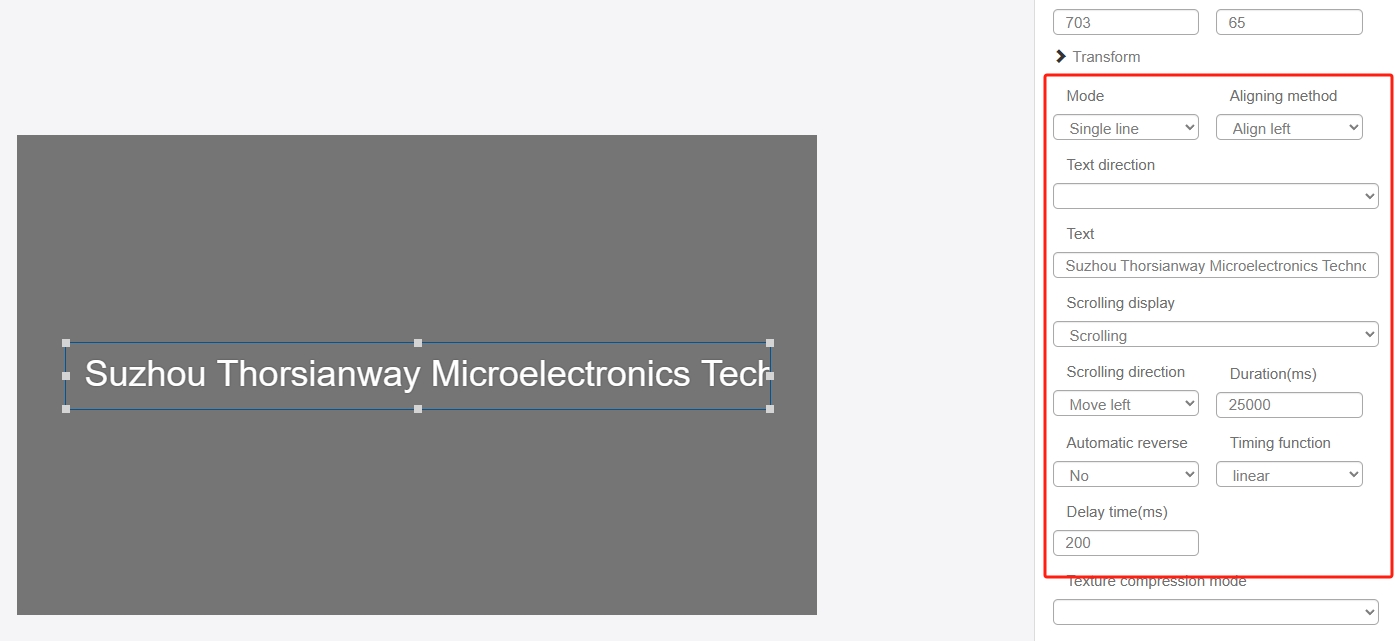
The text scrolling effect is as follows: