Slide Block
Click "Add Control" button in "Edit" menu, and click "Slide Block" in the drop-down list of controls. The message "Add Widget Successfully" will pop up in the upper right corner of the interface. In the "Edit Area", you can see the newly added Slide Block control, and you can edit it in the "Properties" column.

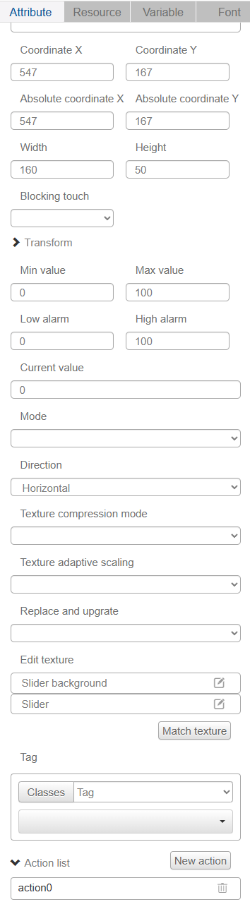
Name, ID, Coordinates, Width, Height, Blocking Touch, Transform, Texture Compression Mode, Replaceable Upgrade, Texture are common attributes, which are introduced in the "Basic Design - Edit Attributes" section, so we won't repeat them here.
"Minimum" and "Maximum" are the range of Slide Block value.
The "Low Alarm" and "High Alarm" are two flag bits for the Slide Block value. By setting the action, you can realize that when the Slide Block value crosses the set alarm value, the corresponding action will be triggered.
The "Initial Value" is the starting position of the Slide Block.
The default mode is Normal Mode and Complex Mode. The default is Normal Mode. The Slide Block in Complex Mode has a trailing texture that can be set, which means the Slide Block will leave a trace on the area it slides over.
Normal mode - Slide Block without trailing texture

Complex mode - Slide Block with trailing texture

The "Direction" drop-down list has horizontal and vertical options, so you can choose the direction of Slide Block sliding to be horizontal or vertical according to your needs.