Progress
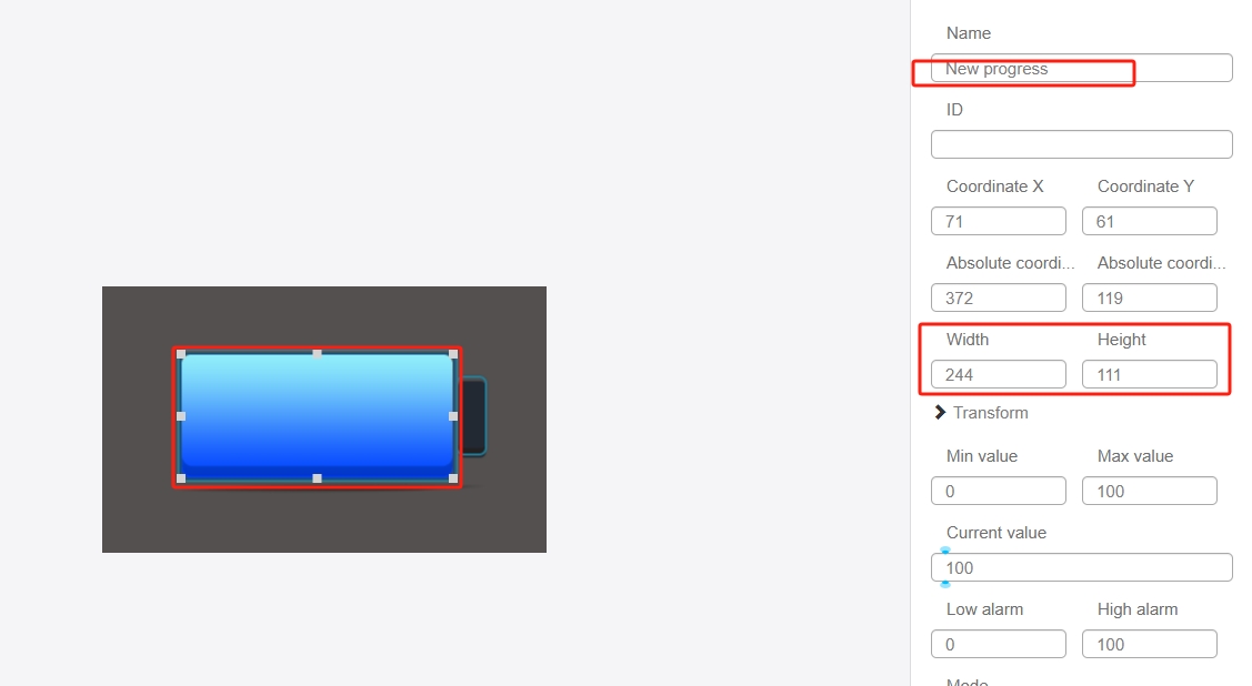
The Progress control allows you to visualize values in the form of a Progress, which is suitable for displaying information such as power consumption. Click the "Add Widget" button in the Edit menu, and then click "Progress" in the drop-down list of widgets. In the upper right corner of the interface, the message "Add Widget Successful" will pop up, and in the "Edit Area", you can see the newly added Progress control, and you can edit it in the "Properties" column.


Name, ID, Coordinates, Width, Height, Block Touch, Transform, Texture Compression Mode, Replaceable Upgrade, and Texture are common attributes, which are introduced in the "Basic Design - Edit Attributes" section, so we won't repeat them here.
"Minimum" and "Maximum" represent the corresponding values when the Progress is "empty" and "full" respectively. The input range is from -999 999 999 to 999 999 999.
The "Current Value" indicates the current value of the Progress in the editing area, and the Progress in the editing area will be changed accordingly after modification.
The "Low Alarm" and "High Alarm" are the two flag bits of the Progress value. By setting the action of the Progress, you can realize that when the value of the Progress crosses the set alarm value, the corresponding action will be triggered.
In the "Mode" drop-down list, there are three options: "Normal Progress", "Color Change Progress" and "Multi-color Progress". There are three options in the "Mode" drop-down list. The main difference between the three types of Progress is the display effect. After selecting "Normal Progress", there are two options in "Texture Settings": "Progress Underline" and "Progress". and "Progress" in "Texture Settings".
After choosing "Color Change Progress", there are "Progress Underline", "Initial Color" and "End Color" in "Texture Settings". and "End Color". The "Initial Color" and "End Color" correspond to the color of the Progress when the value is the minimum and maximum respectively, and the color of the Progress will change from the initial color to the end color as the value changes.

"Multi-color Progress" can set the threshold mode, you can choose two colors or three colors, i.e. set one threshold or two thresholds. When the value of the variable bound to the Progress exceeds the set threshold value, the color or picture of the Progress will change, and it will change once when it exceeds one threshold value.

Users can choose whether to turn on the Progress animation effect that comes with the system according to their needs. If you choose to turn on the animation, you need to input the duration of the animation, for example, 200ms, the Progress will show the animation effect when traveling.
There are four options in the "Direction" drop-down list: left to right, down to up, right to left, up to down, users can choose according to the traveling direction.
The "Cursor" drop-down list has two options: "Cursor" and "No Cursor". If you select "Cursor", you can edit the texture of the cursor in the texture settings.

Note that the "ProgressBarBase" and "ProgressBarHighlightTexture" of the ProgressBarControl are presented in a completely overlapping form. "If you encounter a situation where the "ProgressBarBase" and "ProgressBarHighlightTexture" are not completely overlapped (i.e., the area of the ProgressBarBase is larger than the ProgressBarHighlightTexture), it is recommended to strip off the textures of the ProgressBarBase and the ProgressBarHighlightTexture. "For example, the following layer control is used to insert the Progress underline, and the Progress control (with the Progress underline set to transparent) is used to insert the Progress highlight texture, as shown in the following example.
Bottom Layer
Top Layer