Button Group
Click "Add Control" button in "Edit" menu, and then click "Button Group" in the drop-down list of controls. The message "Add widget successfully" will pop up in the upper right corner of the interface. In the "Edit Area", you can see the newly added Button Group control, and you can edit it in the "Properties" column.

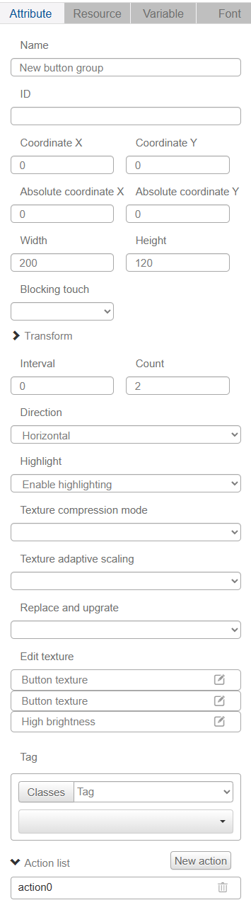
Name, ID, Coordinates, Width, Height, Block Touch, Transform, Texture Compression Mode, Replaceable Upgrade, and Texture are common attributes, which are introduced in the "Basic Design - Edit Attributes" section, so we won't repeat them here.
"Pitch" is the distance between buttons in the Button Group, "Number" is the number of buttons in the Button Group, the minimum value of "Number" is 2, the maximum value is 15.
The "Direction" drop-down list has two options, horizontal and vertical, indicating the direction of the buttons, which can be selected by the user according to the demand.
The "Highlight" drop-down list has two options, "Enable Highlight" and "Don't Enable Highlight". "Enable Highlight" is applicable to non-touch screen devices. When a non-touch screen device needs to change the state of a button, you can enable highlighting and click the left, right and OK buttons to change the state of the button.