Dashboard
Click "Add Control" button in the "Edit" menu, and then click "Dashboard" in the drop-down list of controls. In the upper right corner of the interface, the message "Add Widget Successfully" will pop up. In the "Edit Area", you can see the newly added dashboard control, and you can edit it in the "Properties" column.
Name, ID, Coordinate, Width, Height, Block Touch, Transform, Texture Compression Mode, Replaceable Upgrade, Texture are common properties, which are introduced in the "Basic Design--Edit Properties" section, so we won't repeat them here.
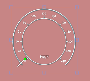

The "Minimum Angle" and "Maximum Angle" indicate the range of rotation of the instrument cluster pointer.
"Minimum" and "Maximum" correspond to the value of the instrument panel when turning to the "Minimum Angle" and "Maximum Angle" respectively, and the input range is from -999 999 999 to 999 999 999. The input range is from -999 999 999 to 999 999 999. The "End Mask" and "Start Mask" are the areas where the pointer is not displayed, as if it were covered. The start mask is the minimum angle of the non-displayed area, and the end mask is the maximum angle of the non-displayed area.
Center of rotation X, Y is the offset of the top left corner of the pointer from the top left corner of the dashboard background. The default rotation center is the center of the dashboard background, which is read-only mode and cannot be modified by the user.
Rotation I.D. is the offset of the pointer in the direction of the rotation radius, a positive R.I.D. is the offset of the pointer in the direction away from the rotation center, and a negative R.I.D. is the offset of the pointer in the direction close to the rotation center.
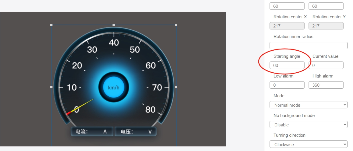
The "Start Angle" indicates the initial position of the pointer. The "Current Value" indicates the current display value of the instrument panel, after modification, you will see the corresponding changes in the editing area.
"Low Alarm" indicates that the action can be triggered when the dashboard value is lower than the set value, "High Alarm" indicates that the action can be triggered when the dashboard value is higher than the set value.
The "Mode" drop-down list has "Simple Mode" and "Complex Mode". The difference between the modes is mainly in the display effect. The texture setting of "Simple Mode" includes "Dashboard Background" and "Dashboard Pointer"; "Complex Mode "In addition to "dashboard background" and "dashboard pointer", "light band effect" is also added.
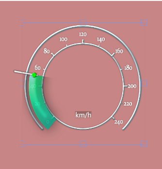
The user can select the direction of rotation of the pointer as "clockwise" or "counterclockwise".
You can choose whether to turn on the system animation or not. When the animation is on, set the time curve and duration to realize the animation effect.
The difficulty in using the Gauge control lies in the dial calibration, an example of dial calibration is provided below:
- Add the dashboard control in the IDE and upload a dial background and pointer in the "Resources" column.

- Select Simple Mode, Clockwise Mode for the dashboard control, insert the dial background and pointer into the "Texture Settings" of the dashboard control, and click "Match this texture" to adjust the width and height of the control to the resolution of the dashboard background map (or light band map) automatically.
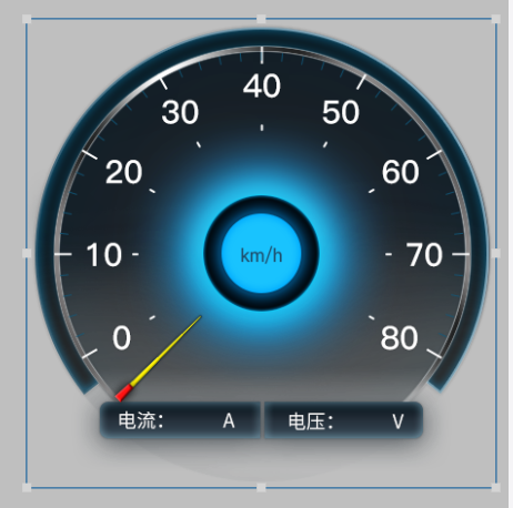
- Set the current value to 0.
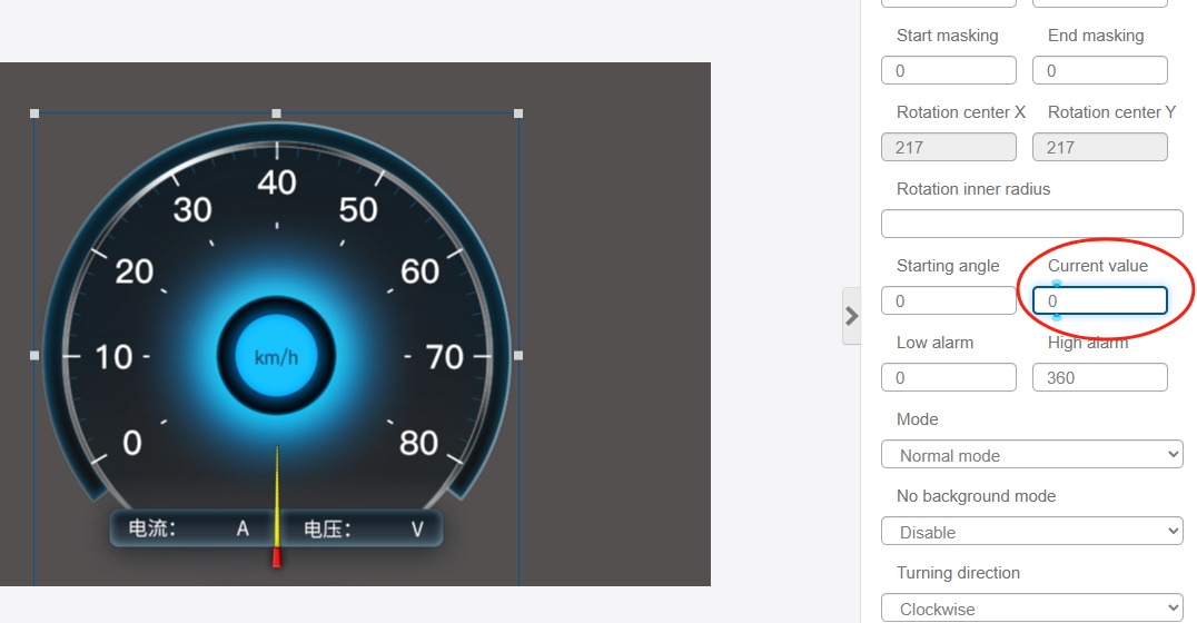
- Adjust the "Start Angle" value so that the pointer is aligned with the "0" scale.
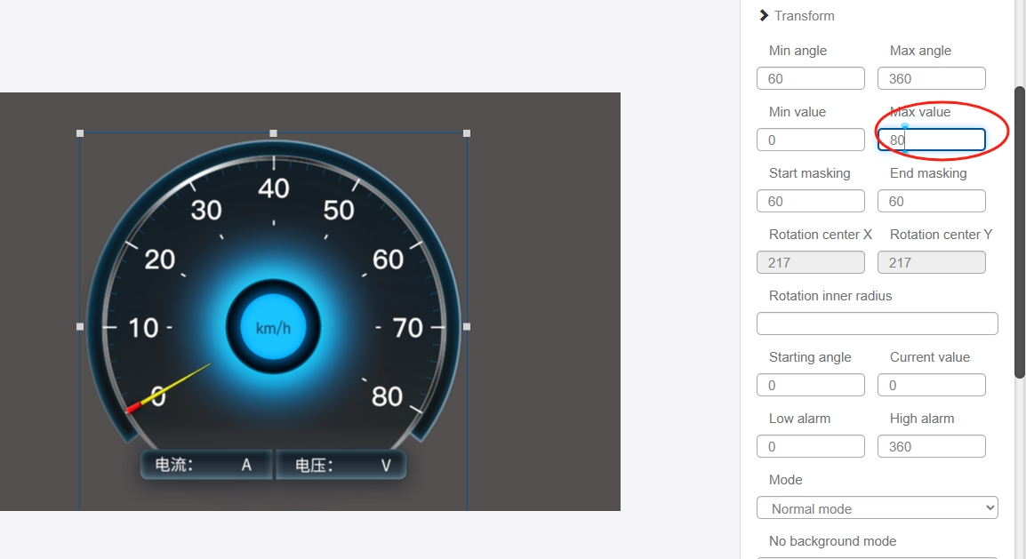
- Adjust the "Maximum Value", the maximum value can take the maximum value on the dial "80" or "400", "800 The maximum value can be taken from the dial "80" or "400" or "800", whatever you want, as long as you multiply it by the corresponding multiple when you assign the value to the variable bound to the control later on.
Adjust the "Current Value" to "80".
Adjust the "Maximum Angle" so that the pointer is aligned with the "80" scale.
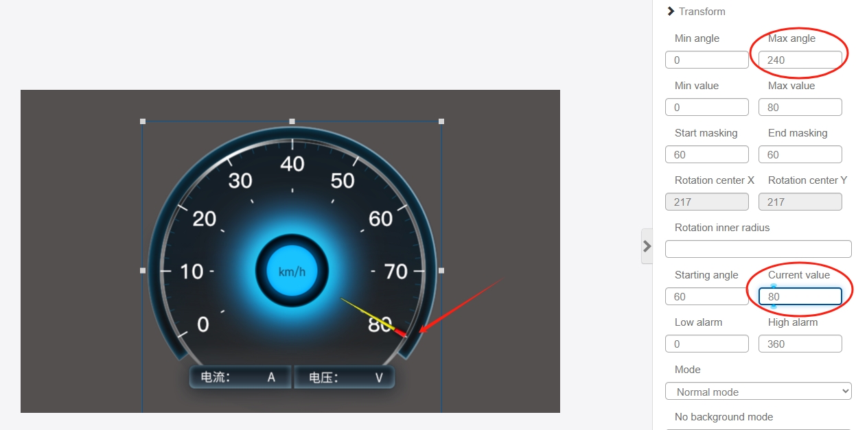
- At this point, the calibration of the dial has been completed, you can try to change the "current value" to 30,40 to observe whether the pointer indicates the correct, no problem to the dashboard control can be bound to the appropriate variables.